Redesigning the future of online technical education.

Goal
Redesign existing features based on testing and create amazing new features to push coding rooms to the next level and make the ultimate all-in-one teaching tool.
The Design
Navigation
The first thing I was tasked with when joining coding rooms was redesigning the page navigation, it was dense, confusing, and was their #1 source of complaints from customers.
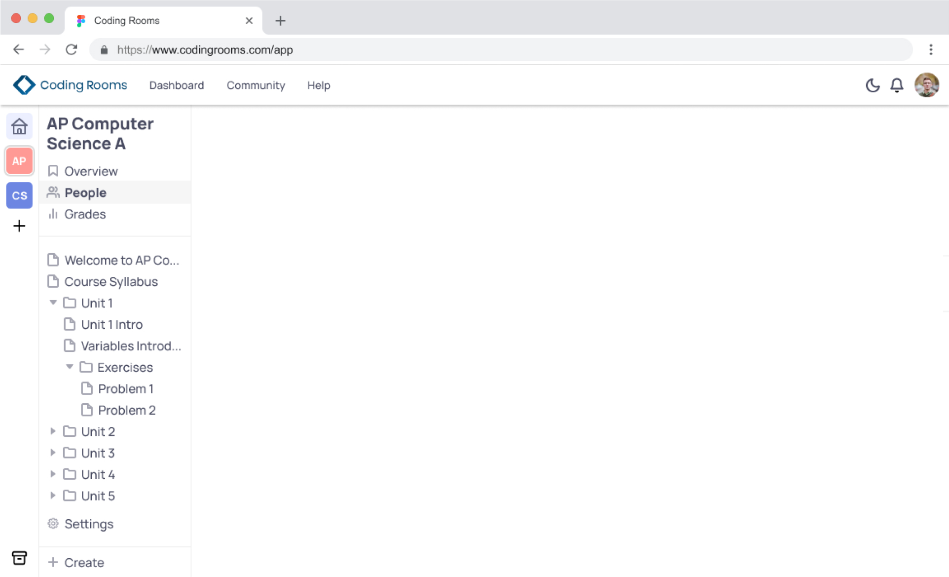

1.
Course title - moved the course title to the header, it was just taking up too much space, and I felt the header section was being underutilized. I also gave the page navigation options more space, updated the font to something cleaner and easier to read at smaller font sizes.
2.
Course switcher - another section that took up room and I believed to not be frequently used by users.I couldn’t imagine a scenario where most teachers would frequently need to move between courses, and wanted to give them more horizontal real estate back. So I moved it to the header with a drop down and search, as well as a quick way to create a new course. After testing this, users fell in love and appreciated having more room for content on the page.

3.
3.
Page Navigation - This was the biggest complaint section. It was very dense, hard to navigate, and gave no indication of what page you were on. So, I first moved the chevrons to the right, to mimic OS file navigation, helping users quickly understand how it works. I also added the file tree nesting line to help guide the users eye to be able to quickly navigate to the sub-folders. As well as added a dot, and changed the color of the icon and text of the selected page, so there is an easier way to find right where you are.

Student View
Unit sections change color and slowly fill up to completion as students finish assignments
4.
Settings - A small but welcomed change. When there were more than 6 or so folders, settings hid below the bottom menu and was hidden unless users scrolled. So I moved it to be fixed in the footer section next to create.
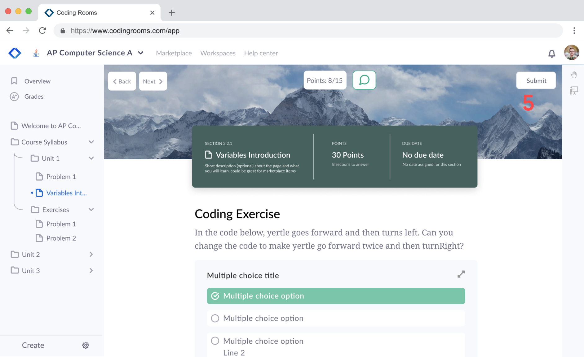
Assignments
This was the biggest change, a complete redesign of the page designer / student view. This is where users spent most of their time, and had the most issues. Students would frequently forget to submit, many users didn’t ever notice that “back” and “next” for pages even existed, and the page was just hard to scan. Below are the teacher views and student views.
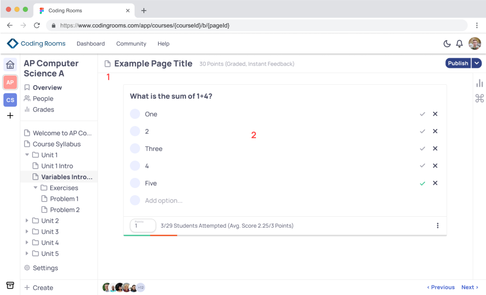
1.
Course info - this section was a total overhaul. There was lots of content we wanted to fit and give users quick access to, but limited space. We also wanted to allow users to be able to customize the page and make it beautiful. So, I first created the header card to house all of the important info, name (added description field), total page points, and policies, which is how users set due date, submission cutoff, etc. This was originally buried in the dropdown next to publish ( see #4 ). I also added the background behind the card. A series of gradients and default images are available, and the option for users to upload their own. The whole section scrolls away as the user scrolls down the page, giving more room for the page content itself.
2.
Page blocks - I redesigned all of the “blocks” on the page, which are the interactive portions. Multiple choice, IDE, short answer, etc. This one here is the multiple choice. I changed how users were able to tell if an answer was right or wrong, and gave a temporary success message in the submit button when the users got the question correct.
3.
Page Navigation - During user testing, only 2 users said they even knew back and next were there. It was out of the way from the rest of the content and where the users mainly focused their eyes, so I moved it to the new top navigation. After testing this with users, they loved it, and said they much preferred it over clicking the left hand nav for quickly going back and forth.
4.
Settings - A small but welcomed change. When there were more than 6 or so folders, settings hid below the bottom menu and was hidden unless users scrolled. So I moved it to be fixed in the footer section next to create.
Student Views
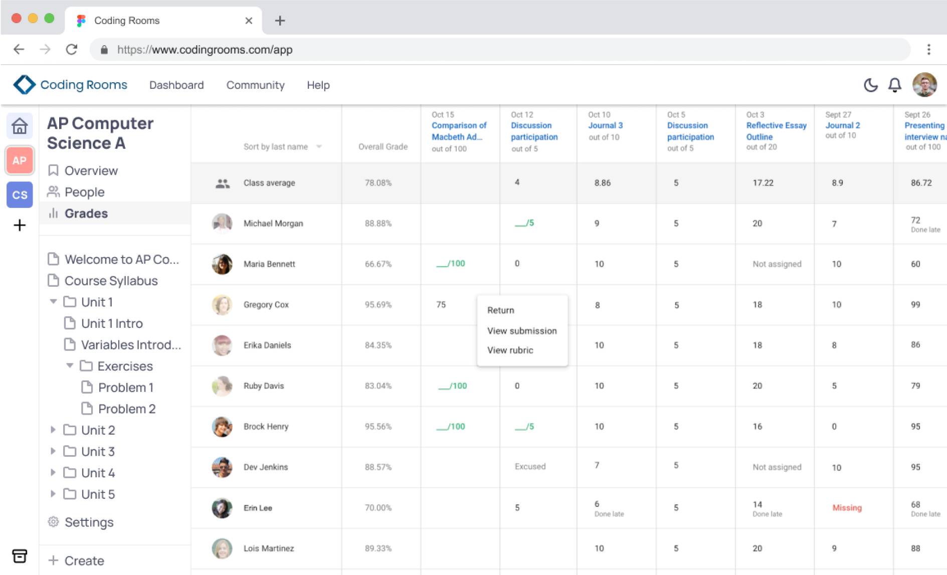
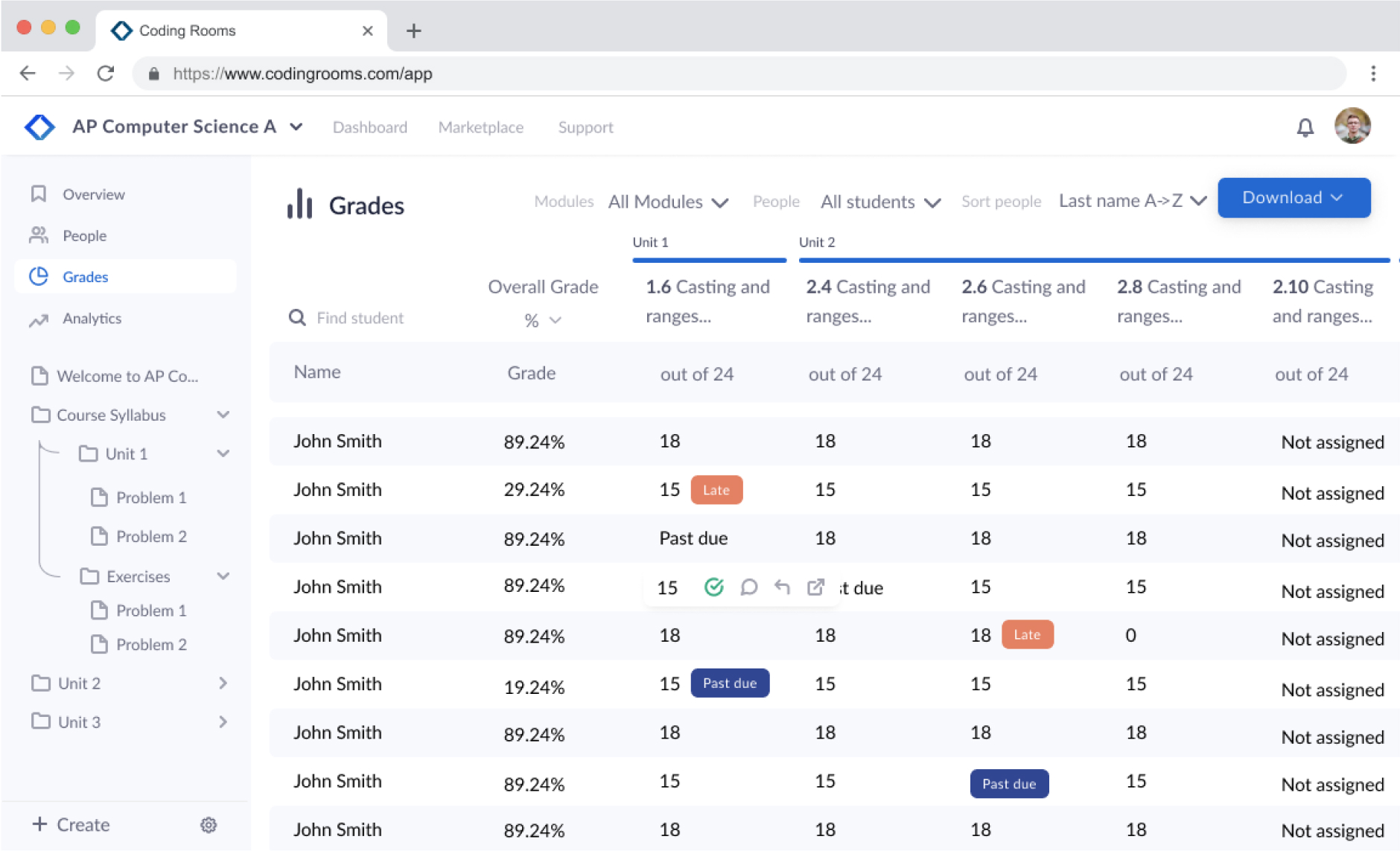
Gradebook
This section is straight forward, more of a refresh. Made lots of quality of life updates, and a couple new features like sort, and tags for if a student is late or missing an assignment
Let's chat.
Phone: +1 (401) 477-3336
Email: [email protected]
Socials: @Dylankiley
© Dylan Kiley 2023
Product Designer
Built with Pride & Love